
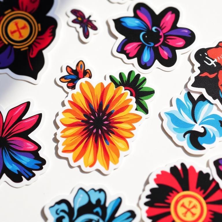
The most common quality complaint in printing is not sharpness. It is colour: "it looked brighter on my screen." That is not a printing error, it is physics, and you can design around it.
Screens add light, presses subtract it
Your monitor creates colour by mixing red, green and blue light (RGB). Paper creates colour by layering cyan, magenta, yellow and black ink (CMYK) that absorbs light. Light can be added endlessly; ink can only subtract. The result: RGB can display thousands of vivid colours that no ink on earth can reproduce.
The colours that shift the most
- Electric blues turn purple-ish (the classic disappointment).
- Neon and lime greens flatten noticeably.
- Bright oranges and hot pinks lose their glow.
- Deep, rich blacks need a specific recipe (see below).
How to protect your design
Design in CMYK mode from the beginning if your tool allows it (Illustrator, InDesign and Affinity all do). You will make colour decisions against what the press can really produce, instead of falling in love with a colour that cannot exist on paper.
Get your blacks right
Pure 100% K black looks grey-ish over large areas. For solid black backgrounds ask for "rich black", a mix such as C60 M40 Y40 K100, which prints deep and even. But keep small body text at plain 100% K, otherwise the four inks can misregister and text looks fuzzy.
What we do on our side
Every file you upload is checked before press. If you send RGB we convert with a profile that preserves as much vibrancy as possible, and our AI preview flags colours likely to shift so you see it before you approve, not after delivery.
Ready to put it into practice?
Upload your artwork and our checker will flag resolution, bleed and colour issues before you order.
More print guides
How to prepare print-ready artwork (the 6-point checklist)
Bleed, safe zones, resolution, colour space, fonts and export settings. Get these six things right and your file sails through pre-press.
Paper weights explained: choosing the right GSM
90gsm feels like a newsletter, 400gsm feels like a business card. A practical guide to picking paper weight and finish for every print job.