
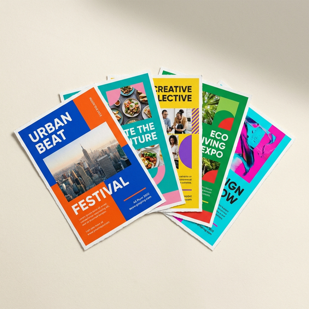
A flyer is not a small poster. It is held at arm's length for about two seconds while someone decides whether it is worth keeping. Everything about the design should serve that two-second decision.
Lead with the offer, not the logo
The biggest thing on the flyer should be the reason to care: "2 for 1 Tuesdays", "Grand opening 12 July", "Free consultation". Your logo matters, but it belongs in a corner, not the headline slot. People keep offers; they do not keep logos.
One flyer, one message
Every extra message halves the impact of the others. If you have three things to say, the flyer says the strongest one and your website says the rest. The same rule applies to fonts (two maximum) and colours (your brand palette, not the whole wheel).
Make the next step impossible to miss
Every flyer needs exactly one call to action: a phone number, a QR code, a "show this flyer" instruction. Put it in the bottom third, make it bold, and give it space. A QR code should be at least 20x20mm to scan reliably from a poster or flyer.
Use both sides
Double-sided printing costs little extra and doubles your space. A strong pattern: the front is the hook (offer plus one image), the back is the detail (menu, price list, map, opening hours).
Print practicalities that save money
- A5 is the workhorse size: big enough to design, small enough to hand out.
- 170gsm silk is the standard feel; go 250gsm+ if the flyer represents a premium service.
- Order the next quantity break up. The unit price drops steeply, and running out mid-campaign costs more than the extra hundred sheets.
Need the design done for you? Our design service produces print-ready artwork at a flat hourly rate, and it goes straight to our own press with no file-format surprises.
Ready to put it into practice?
Upload your artwork and our checker will flag resolution, bleed and colour issues before you order.
More print guides
How to prepare print-ready artwork (the 6-point checklist)
Bleed, safe zones, resolution, colour space, fonts and export settings. Get these six things right and your file sails through pre-press.
Paper weights explained: choosing the right GSM
90gsm feels like a newsletter, 400gsm feels like a business card. A practical guide to picking paper weight and finish for every print job.